Client
Tasheel by eXtra
Timeline – 2022
Web+App UX & UI
My role
UX Designer @ RBBI
Client
Tasheel by eXtra
Timeline – 2022
Web+App UX & UI
My role
UX Designer @ RBBI
The case study is about the Tasheel Installment Plan, a customer-centric initiative by eXtra—the project aimed to provide customers with a seamless and convenient purchasing experience.
The focus was on enabling customers to choose their desired items effortlessly and offering a flexible payment option through installment plans, enhancing their overall shopping journey.
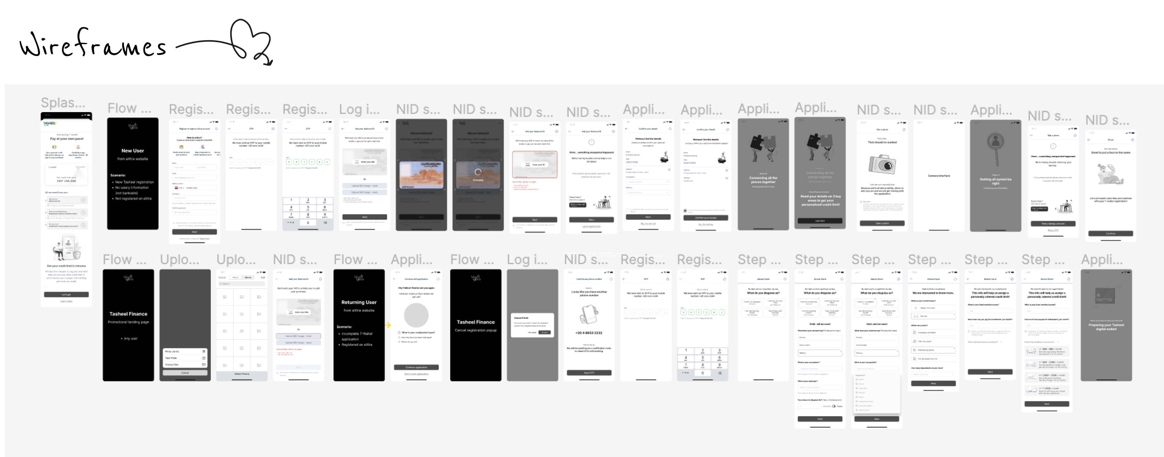
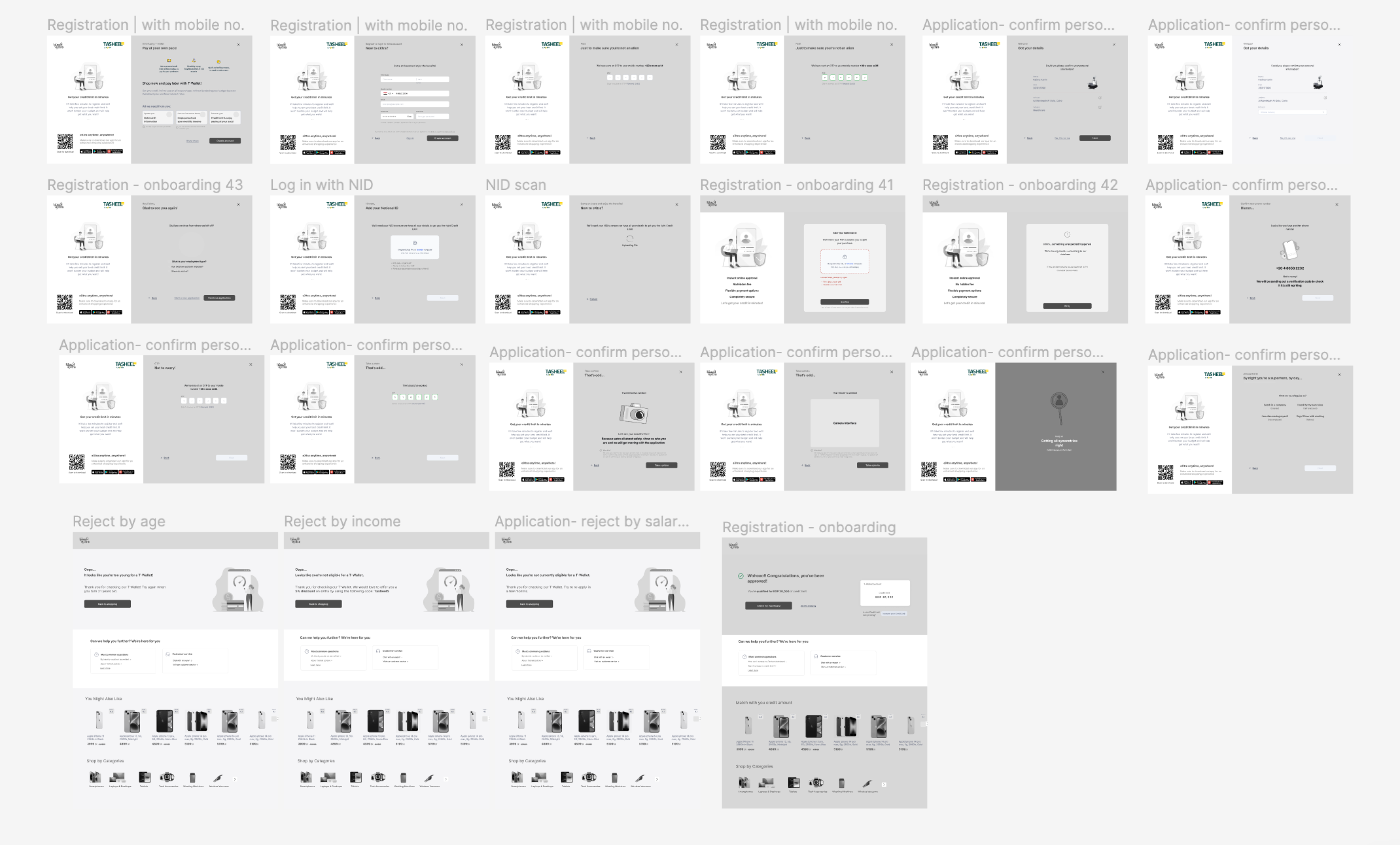
The first hurdle was the onboarding process. It was like a maze that customers had to navigate to access the installment plan.
The second challenge was the dashboard, a crucial tool for customers to track their payment progress and manage their plans. It needed to be as user-friendly as a favorite app.
At the end of this adventure, we had successfully enhanced the customer’s journey. The onboarding process was now a straight path, easy to understand and follow.
The dashboard was a friendly guide, helping customers effectively track their payment progress and manage their installment plan. The customers were happy, and so were we.


