Project Introduction
About Madakto:
Madakto is a company that has been at the forefront of designing and manufacturing access control gates in Iran and the region since its inception in 2013. Their team of experts has consistently combined science and technology to introduce state-of-the-art gates and road blockers that meet the highest standards of quality and reliability.
Problem:
Outdated Interface and Poor Efficiency Madakto’s website has an outdated interface and lacks visual appeal, which can turn away potential customers. Moreover, the website suffers from poor search engine optimization (SEO) with numerous uncategorized contents, making it hard for users to find relevant information efficiently. Key Issues:
- Outdated interface design that fails to engage users
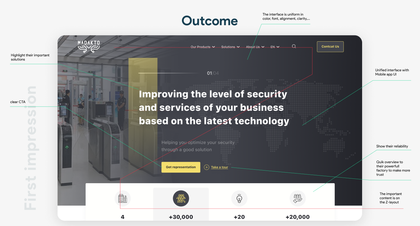
- Poor call-to-action (CTA) strategy, hindering conversion rates
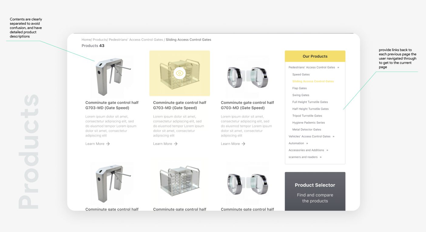
- Excessive information overload on a single page, causes confusion and frustration among users.
Challenge: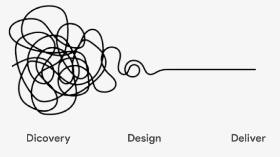
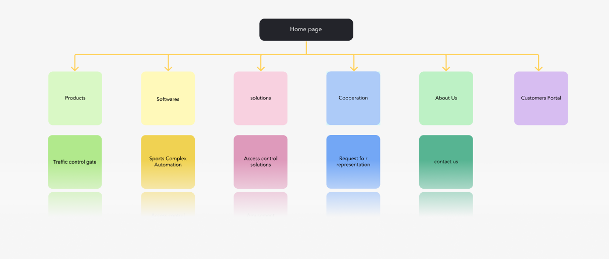
In the redesign process, our main challenge was efficiently conveying the vital content while restructuring it in a clean, uniform manner with a unified voice. With a large amount of content to work with, we employed data architecture techniques to prioritize information for the users.
Additionally, the corporate color of Madacto being yellow posed a challenge to ensure its accessibility for all users. We conducted a thorough check to ensure the color scheme was user-friendly for a seamless user experience
So what do I need to focus on?
Information Architecture – Usability – Accessibility
Road map :
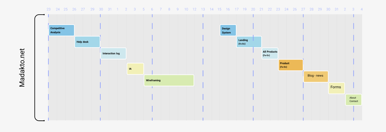
Information Architecture:
